Using Bookmarks in Power BI

Using bookmarks in Power BI help you capture the currently configured view of a report page, including filtering and the state of visuals, and later let you go back to that state by simply selecting the saved bookmark.

You can also create a collection of bookmarks, arrange them in the order you want, and subsequently step through each bookmark in a presentation to highlight a series of insights, or the story you want to tell with your visuals and reports.

In this post we’ll quickly go over how to create a few bookmarks and view them as a slideshow if you will.

I’m going to use my March Madness Report I created in an earlier post. Once my report is opened in Power BI Desktop, I’m going to click on the View tab in the ribbon and select “Bookmarks Pane”
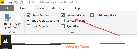
Bookmarks Pane

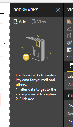
This should bring up a new Bookmarks pane inside PBI Desktop:

Bookmarks

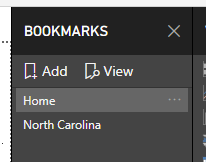
Remember, bookmarks are used to capture the current view of the report so I’m going to use the default view where I’m showing all data and I’m going to name the bookmark “Home”. Make sure all filters are selected to show all data and click Add under the bookmark pane. This will create a new Bookmark, named Bookmark 1. Click the ellipsis and select rename to rename the bookmark appropriately.

Next, I like North Carolina, so I’m going to go to my Team Filter and choose North Carolina which will show me data for only this team.
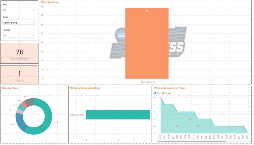
Team Filtered Power BI Report

In my bookmark pane, I’m going to click Add again and rename to North Carolina.

Next, I want to view data on North Carolina from 2000 to present so I’ll change the Year Filter.
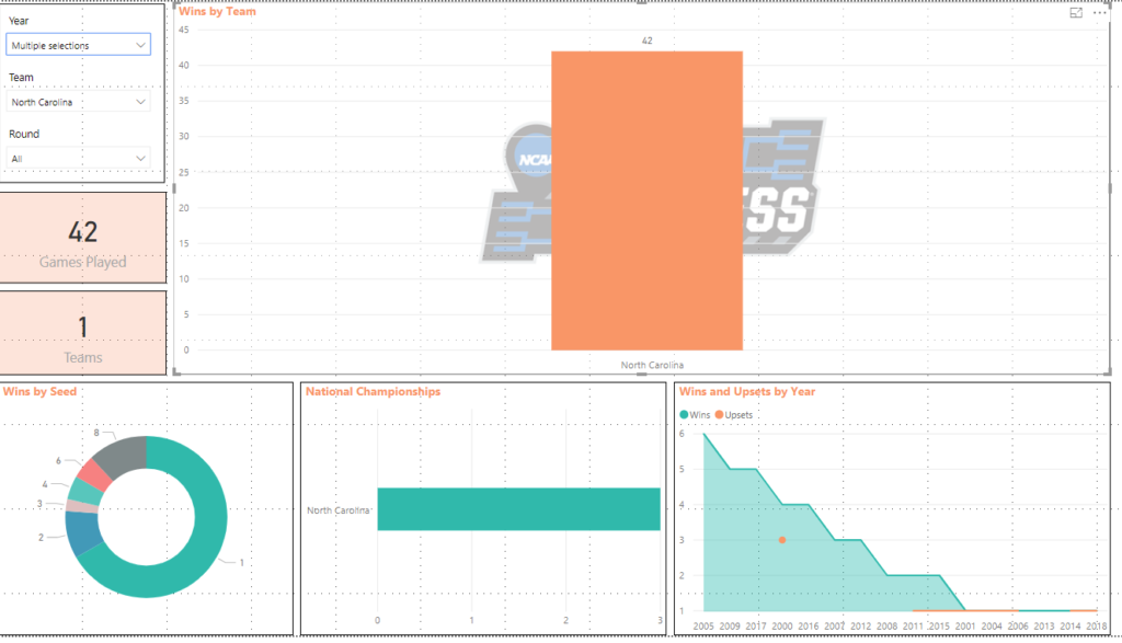
Team and Year Filtered Power BI Report

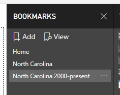
In my bookmark pane, I’m going to click Add again and rename to North Carolina 2000-present.

Now, if I click on any of bookmarks, it will take me to the data that was saved for each. This is a great way to present data in a meeting/conference so you don’t have to manually change the filters during the engagement.

We can also click the View button in the Bookmark pane to view a slideshow using the arrows at the bottom to navigate:

Creating a Dynamic Date Range Title in Power BI

Creating a dynamic title in Power BI helps present the data and let’s the viewers know what the data is filtered on. In this post I’ll go over how to do this…

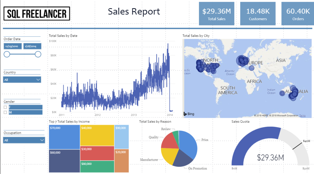
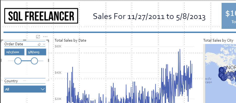
I have a sales report that I’d like to add a title that is based on the Order Date Slicer. Currently, the title is static text “Sales Report”

Sales Report

To create my dynamic title, I’ll first need to create a measure table that has my Order Date data. In this case, that table is FactInternetSales and the column is OrderDate.

To create a measure, click New Measure in the Power BI Desktop ribbon

Power BI Desktop Ribbon

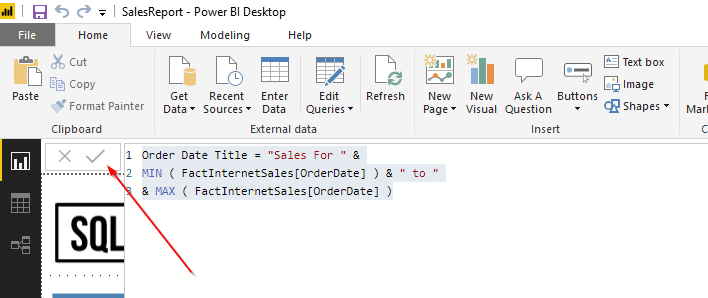
Next, you’ll see a window where you can type code. In this example, I’ll use the following DAX

Next, you’ll see a window where you can type code. In this example, I’ll use the following DAX

Order Date Title = “Sales For ” &
MIN ( FactInternetSales[OrderDate] ) & ” to “
& MAX ( FactInternetSales[OrderDate] )

Let’s walk through this real quick.

The first line (Order Date Title = “Sales For “ &) is basically naming the measure and adding the beginning text for the title.
The second line (MIN ( FactInternetSales[OrderDate] ) & “ to “) is finding the minimum order date from FactInternetSales.OrderDate and then adding the “to” text.
The last line (MAX ( FactInternetSales[OrderDate] ) is finding the maximum order date from FactInternetSales.OrderDate.

This one was pretty easy. Once I’ve typed my DAX, hit the checkmark to make sure there are no errors and the click off screen.

DAX

Our measure has been created! Let’s go back and find it under the FactInternetSales fields pane.

Power BI Fields

Next, let’s click on the Card Visualization and move and size it appropriately to fit in our title space.

Card Visualization

While the card is highlighted, click on the new measure from the Fields pane and it will populate the card with the measure we created.

The only thing left to do is format the title and we’re all set! If we change the Order Date Slicer, you’ll notice the title changes with the date. See live example at the beginning of this post.

March Madness Power BI Dashboard

At the beginning of the year I set a goal to learn something new. I’ve always loved business intelligence and bringing data to life in the form of dashboards and charts so for the 1st half of the year I wanted to focus on Microsoft’s Power BI. I’m not going to explain what Power BI is, but if you want to read up on it go here: https://powerbi.microsoft.com/en-us/

This post is just going to show off my dashboard. ? See live example above.

I’m a huge sports fan and the best time of the year happens to fall in March. Besides my birthday being in March, it’s also March Madness. Hours and hours of basketball. I could of used AdventureWorks for my dataset, but I wanted to use something I’m interested in. I found some data containing every NCAA tournament game result since 1985 (when the tournament was expanded to the 64 team bracket). The dataset contains the year, round (1-6), seed of the teams (1-16), region (1-4) and the scores. Perfect. Let’s use this to create a dashboard.

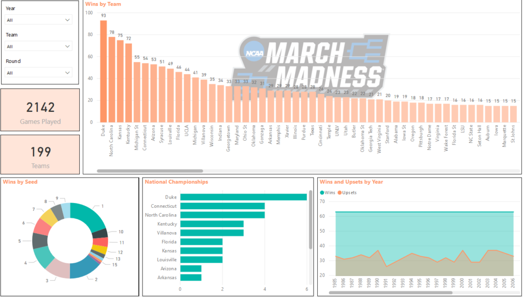
There’s not a ton of data, but I used what I could and tried to answer some questions around wins and upsets. Here’s a screenshot of the final product:

March Madness Power BI Dashboard

You can see Wins By Team (Duke with 93, North Carolina with 78, etc), Wins by Seed, National Championships, and Upsets vs Wins by Year. You can also see that a total of 2142 games have been played with 199 different teams in the tournament.

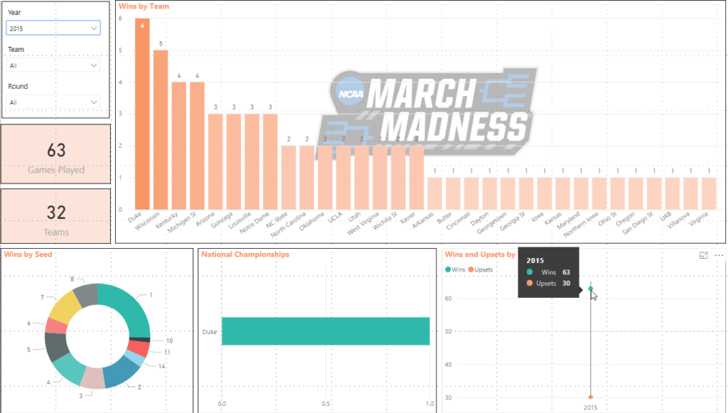
This was really fun and answers a lot of the questions I was thinking in my head while designing. The top left corner also has slicers which help filter the data. For example, if I wanted to see only the data for 2015 I could change the Year slicer to 2015 and it would update all my visualizations:

March Madness Power BI Dashboard filtered by year 2015

You can see that Duke won the National Championship from the National Championships visualization. If you hover over the Wins and Upsets visualization, you’ll see there were 30 upsets out of 63 games.

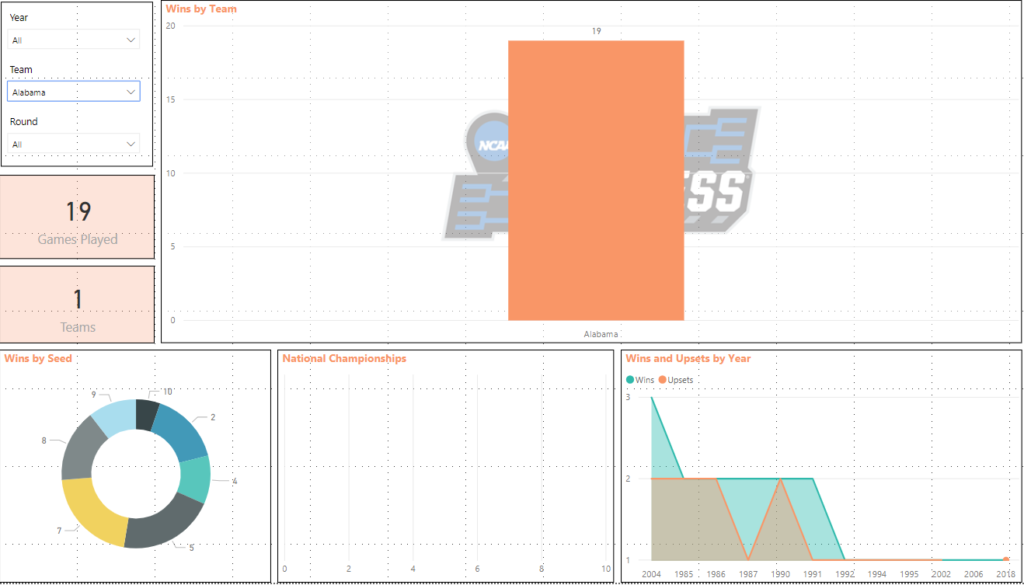
Let’s say I want to view data for a certain Team. Let’s choose Alabama Crimson Tide. If I change the Team slicer to Alabama I can see some data based around this team.

March Madness Power BI Dashboard filtered by team Alabama Crimson Tide

Alabama has won 19 NCAA tournament games, 0 national championships, has been a 5 or 7 seed 21% of the time and they’ve had a few upsets along the way. Not bad for a football school.

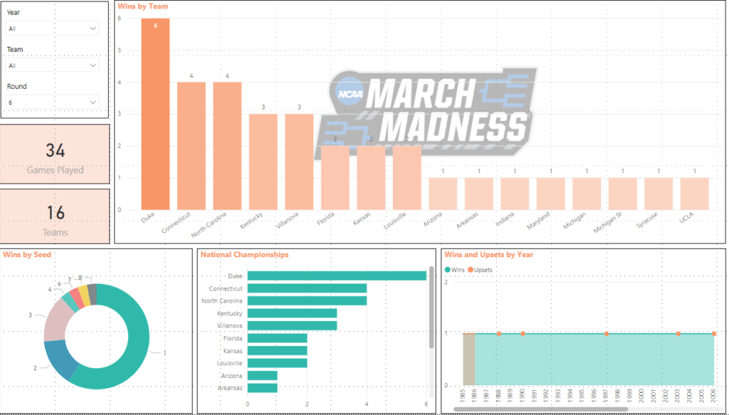
What about data for the National Championship game? I can change the Round slicer to 6, which is the National Championship round and view the data this way.

March Madness Power BI Dashboard filtered by Championship game

I can see out of 34 games, there has only been 16 different teams make the National Championship. Duke leads the way with 6, followed by North Carolina and Connecticut with 4. The 1 seed has played in this game 59% of the time, and there were upsets in 1988, 1990, 1997, 2003, 2006, and 2016.

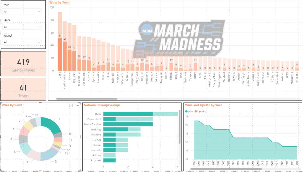
We can also click on the visualizations themselves to view data. For example, if we reset our slicers to show all data and click on the #1 seed in the Wins By Seed Donut Chart we see the following:

March Madness Power BI Dashboard filtered by #1 seed

We can see that the #1 seed has played in 419 games with a total of 41 different teams. Duke has won 51 games as the #1 seed while North Carolina has won 46. Duke has also won the National Championship 4 times as the #1 seed and in 1999 the #1 seed won 17 games which is the highest.

Really cool stuff. I loved working on this project and working with this data.